CHAPTER 3: Tweak Your Design Layout
Site Architecture & Usability
 The Internet is cluttered with millions of sites competing for a limited number of eyeballs and time. As we’ve mentioned, you’ve only got a few seconds to catch the reader’s eye and stir a call to action. That means everything on your site has to be clean, easy-to-find and very user friendly. When your site design is clean and crisp, your readers will have no problem finding the information they’re looking for and the call to action you want them to take.
Here are some thoughts to keep in mind when designing your site:
- Every word matters – Between limited attention spans and the ever growing influence of Google Panda updates, there just isn’t room for wordy content anymore. Words take up space and clutter up your site. So use as few of them as possible. Succinct paragraphs read better than huge blocks of type.
- Remove unnecessary clicks – Back when page views were the most important web metric, breaking up articles into as many pieces as possible made sense. But that’s not how the web works anymore. You’re better off linking to internal content rather than having a multi-piece article that requires a lot of clicking.
- Consider the importance of color, space and clean design – Too often, webmasters clutter pages with as much information as possible. Sensory overload may be an effective tool for land-based casinos, but it’s a real turn off on the Internet.
- Keep control of how much information is appearing on your pages at one time. Remember your value proposition and stick to it. If you focus on providing something useful, everything else will work itself out.
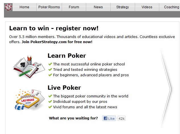
For a good example of these principles in action, take a look at landing page on www.pokerstrategy.com.
 Right away you can see there’s a lot of information packed on this page, but it’s easy to read and right up top is a clear value proposition and call to action, Learn to Win – Register Now. It doesn’t get much clearer than that.
On the right hand side of the page is another very clear call to action in the form of a basic registration form. Notice also the large, but unobtrusive, arrow drawing your eyes from the value proposition to the call to action. Pokerstrategy.com is subtle, clean, and loaded with good information.
Customized Themes Drive Traffic
Unless you’re an experienced web designer, there’s no sense reinventing the wheel to come up with top notch site designs. There are plenty of pre-packaged WordPress themes from companies like Flytonic Themes that are designed specifically for gaming affiliate sites by developers who have worked as affiliates themselves.
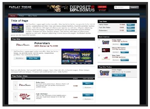
For example, Flytonic’s Shuffle Up Theme is a good fit for poker affiliates. It provides ample room for links to top poker rooms, bonuses and much more. Web masters can easily change elements within the design, such as colors to customize it with their own colors and other branding elements. Other themes like Parlay are designed for sports sites, but can be tweaked to fit almost any gaming site.
 WordPress themes for gambling affiliates are built to make SEO management, banner ad management, and content display simple and easy to read. When someone else has already done the basics, creating a unique site is much easier.
What’s Next? Chapter 4: Player Benefits